


In an age of easily-available graphics software, such as Photoshop, and do-it-yourself website builders, it’s easy to lose sight of what makes great graphic design. There is much more to creating an effective company logo or crafting a website than just throwing type, pictures and shapes on a page – or on a computer screen.
Your company is unique. To stand out in a market and effectively compete for customers, you have to communicate that uniqueness in everything you do, from your business card and letterhead to your website to your brochure, sales presentation or trade show booth.
At SkyHawk Studios, we use tried-and-true marketing basics to develop your company image.
Phase I – Research: With any project, we began by finding out as much as we can about your company and your market, working to understand your objectives and creative vision. We ask a lot of questions to isolate exactly what makes your company unique. We discuss key descriptive terms that you might use to define your firm, such as helpful, prompt and professional.
A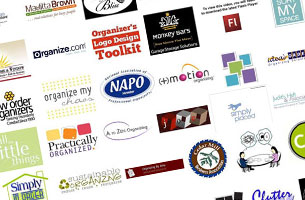 nd we study the logos and branding of your competitors and other firms in your field so we can avoid the trite, the obvious, the overused, and develop something unique, something that will stand out.
We study your products, your processes, your customers. What do your customers like most about your company? What is your Unique Selling Proposition – what do you provide that other firms don’t?
Phase II – Concept Development: Based on all of our research and discussions, we develop a number of possible visual solutions to meet your needs and objectives.
![]() We’ll create and present a number of very different ideas that we feel capture the personality of your company and project a unique image. We give you a broad scope of potential visual directions, we go over these ideas with you, and together we decide on the best solution.
We’ll create and present a number of very different ideas that we feel capture the personality of your company and project a unique image. We give you a broad scope of potential visual directions, we go over these ideas with you, and together we decide on the best solution.
Phase III – Design Development:
At this stage, we take the preferred design concept and present a series of alternate colors, as well as versions of the logo in black and white, and any other possible variations. We create a color palette that reflects the nature of your company, and work out how your branding will be rolled out on all potential platforms, from letterhead and business cards, to your website, to the side of your building.
![]()
![]() Phase IV – Production: Once the final design and color palette are fully approved by you, we proceed to implement your new branding image throughout your promotion and communications, beginning with your business cards and letterhead, and continuing with your website design.
Phase IV – Production: Once the final design and color palette are fully approved by you, we proceed to implement your new branding image throughout your promotion and communications, beginning with your business cards and letterhead, and continuing with your website design.
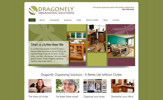
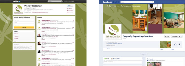
The branding can then be seamlessly integrated into social media – your Twitter page, Facebook page, and any other location.
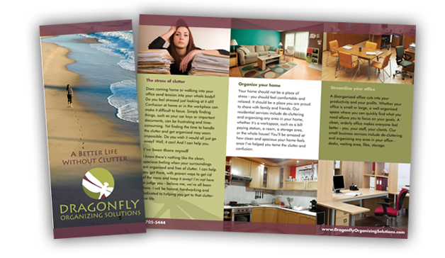
And we’ll make sure your printed promotion and advertising carry on the same theme.
 Consistency of branding is vital to any business. However your potential customers contact you , they must see a consistent image that forwards your brand image. At SkyHawk Studios, we oversee the branding process from concept to full implementation.
You know your company. You know what image you want to project to your customers or clients. Our aim is to understand your goals and your vision, and use our skills to create a company image that will help to bring you the success you are striving for.
Contact us now and let’s discuss your promotional needs.